The Hound of the Baskervilles
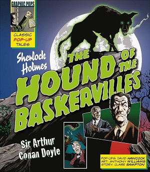 Part of the Graphic Pops series, this is a well done pop-up version of the classic Sherlock Holmes novel. The tale is told in graphic novel form, with most of the text coming in French flaps, leaving the paper artist (David Hawcock) to do his thing in seven showpiece spreads. I thought these were very good, with only a couple (the apartment at 221B Baker Street and Baskerville Hall) being a bit dull. The others are all striking (as pop-ups should be) and make good use of the form for some imaginative effect. The one pull tag is in the spread where Watson draws his gun in the hut on the moor, which also has a door flap to reveal Holmes as he first puts in his appearance. There are a pair of rhyming spreads with the hound and Holmes standing dramatically on clifftops. And there’s a final appearance of the hound’s head that is neat because as it unfolds/pops-up you see inside the hound’s mouth, until its jaws snap shut when the book is fully open and the covers laid flat.

Need a picture of this when it’s open!
LikeLike
Here’s one I took.
LikeLiked by 1 person
Oh blimey that’s quite elaborate. Are they all like that – big/tall I mean.
LikeLike
I think that may be the tallest. But today’s pop-up paper work *is* really elaborate. There are some complicated ones here.
LikeLiked by 1 person
Wow. Cool. I’m glad it’s so well done.
LikeLike
Yeah, they did a pretty good job with this. Quite faithful to the story as well.
LikeLike
That’s impressive! Is this how second childhood’s begin, with popup books? Mrs B and I gave one to our 5year old niece last year 😀
LikeLike