The Hound of the Baskervilles
 When it comes to graphic novel versions of the classics, artists are in a tough spot. They’re rarely free to go their own way and the text, of which there is usually a lot, can be quite an anchor. Nevertheless, the right combination of an artist’s visual style with a classic author’s sensibility can have magical results.
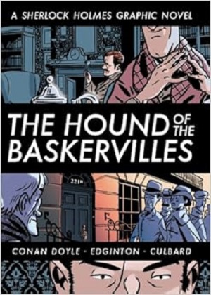
This adaptation of Conan Doyle’s The Hound of the Baskervilles falls somewhere in the middle range. It’s very faithful to the text, not just incorporating a lot of the original dialogue but even keeping the novel’s chapter breaks and titles. Luckily, Doyle’s story isn’t that long so it’s a manageable job. And the art by I. N. J. Culbard isn’t generic. He does have his own style, as perhaps best seen in his signature way of drawing faces with a curved vertical slash that descends from the middle of the forehead to past the end of the nose. I have to say this really puzzled me as it shows up on every face and I couldn’t figure out what it was supposed to correspond to. A cheekbone? Ritual scarring?
Was Culbard’s style a good fit though? I think so, at least for a version aimed at younger people. The violence is softened, with the bruises and welts on Beryl’s body, for example, turning into the faintest of shadowing. And I’m afraid the hound itself, in its climactic appearance, bears an uncomfortable resemblance to Slimer from Ghostbusters. But then the hound, whether in illustrated versions of the story or appearing on screen, is almost always a disappointment, going on over a century now.

Who ya gonna call?
Sherlock Holmes Busters!
Yeah, not nearly the same affect.
LikeLike
Maybe Houndbusters?
LikeLiked by 1 person
That’s better but still not quite there yet….
LikeLike
That line on the faces really is strange. Especially since, from my 5 minutes of research, it appears that in the other two Edginton/Culbard Holmes graphic novels, it doesn’t appear. So he did it just for this one? Bizarre.
LikeLike
It’s pretty striking. Here are a couple of examples:
LikeLike
Does he do that to the women, as well?
LikeLike
I can’t remember now. I had it out of the library and returned it so I can’t check.
LikeLike