Old Man Logan: Warzones
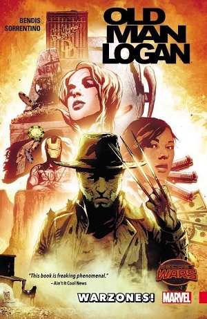 This is the second volume in the Old Man Logan series, though it’s usually labeled as Volume 0 since it provides a sort of prologue to the series later set on Earth-616 and written by Jeff Lemire that kicked off with Berserker. You’ll probably feel a bit lost if you haven’t read Mark Millar’s Old Man Logan and don’t know something about Earth-807128 and the whole concept of Secret Wars and the Battleworld. There’s no way I’m going to try and explain all that here, in part because I don’t think I’d be able to get it right. Suffice to say that things kick off with our hero, now on Earth-21293 (I think) living on a ranch in what looks like Monument Valley cohabiting with Luke Cage’s daughter and bringing up Baby Hulk. When Logan/Wolverine/James Howlett escapes from the borders of the Wastelands he runs afoul of powerful authorities serving “Lord Doom” (he dropped the title of Doctor when he became God of this world).
I’m not going to say anything more. It’s nuts. You really have to know your Marvel universes backwards and forwards to follow along as everything gets chewed up and spat out again like this. At times it’s suggested that the whole thing is an illusion put on by Mastermind or Mysterio or Mystique. Emma Frost also shows up a couple of times and manipulates reality into a “mindscape” that forms another alternate reality. There are good guys who are now bad guys and bad guys who are now good guys. And of course there are zombie versions of everyone too. Because why not?
But I don’t want to be dismissive. This is a weird story but it’s also something genuinely new and different. A lot of this due to the art by Andrea Sorrentino, which is riveting all on its own. You can enjoy a comic like this without reading any of the text (and it might even make more sense that way). What Sorrentino does in infusing each cell with a jolt of kinetic energy is magic. There are knocks against his style, like the fact that he really can’t seem to draw torsos, but even that adds to the effect, as the universe being evoked is such a dark and grotesque place anyway.
I doubt there are many people who sit on the fence when it comes to this series. It’s either the greatest thing going or a headache. I definitely think that as it went on it became repetitive, but this prelude is a comic that I’ve gone back to re-read several times and my appreciation of it hasn’t diminished. Some of the Battleworlds are better than others, but the one conjured here feels truly epic, and if it doesn’t add up to much or goes off the rails that’s OK because they were aiming for a nightmare aesthetic anyway. If you do fully enter into the spirit of things what you get is what feels like a total re-imagination of all things Marvel. And by that I don’t just mean the Marvel universe but the Marvel brand. Of course they were trying to do a lot of that around this same time, but I don’t think ever as successfully and at this scale.